
We humans are very visual creatures. In fact, a large percentage of our brain is dedicated to visual processing!
Using images on websites helps to communicate effectively and to promote brands or products. This makes images one of the main and most essential building blocks of any website.
Statistics show that (on average) more than 50% of the byte-size of a website consist of images. Using them in the wrong way easily brings the user experience of your website down.
In this article, we will go over some of the things you might need to consider when using images on the web.
Choose your images carefully
The right image in the right place, not an easy task. Not getting this part right might result in users losing interest in your website.

Start by making sure that your images match your content. Our brain can process images much faster than text, so combining your content with the right visual elements will serve as an effective method to communicate with your users.
Images should also evoke the right emotions in your users. Make sure that you have your target group in mind when choosing them.
And most important: ALWAYS use high-quality images. Users don't like blurry and pixelated images. While you can always scale images down, scaling up is not really something you want to do.
Avoid using the CSS background-image for non-decorative images
The CSS background-image is intended to be used for decorative purposes only. Search engines and screen readers don’t have access to them, which in return could harm the accessibility of your website if used wrong.
You should use the HTML tag instead. This provides you with the ability to use an alternative text for users who are on screen readers as well as providing text placeholders for users who have images disabled or are using a very slow network.
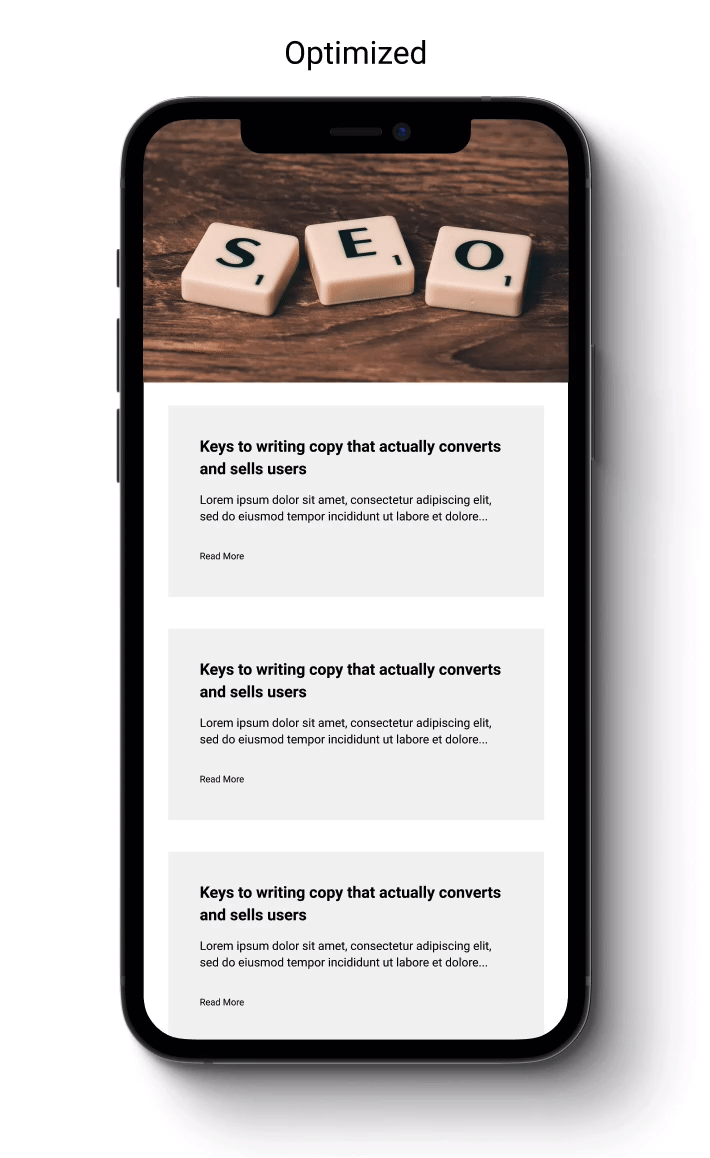
Provide your images with width and height to prevent layout shift
Imagine visiting a website, starting to read an article or trying to click a button and suddenly everything shifts down, causing confusion and frustration. I guess we've all been there!
This is due to the so called cumulative layout shift, which can have a negative impact on the usability of your website.
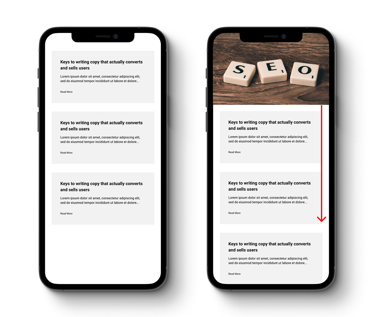
This happens because the browser doesn't know the dimensions of an image until it's loaded and therefore can't decide how much space it has to reserve for the image.
Let the browser know ahead of time what to expect and how to behave by providing the image tag with width and height attributes.

A good alternative is aspect ratio containers as they provide better responsiveness for fluid images.

Serve the correct image size, in bytes and dimensions
Though users are viewing websites on mobile phones and tablets, many are still following the "one size fits all” approach. More than 50% of the images on the web are above 1 MB – meaning that they're most likely not optimized.
This might have a bad impact on the largest contentful paint on your website since images are usually the largest visible elements within the viewport after the page loads.
Start optimizing images for the web with tools like squoosh, which will help you to compress, resize and optimize the image, reducing the loading time on the page.

Use the srcset attribute on the tag to serve the right image size to the right viewport. After all, you should not be serving a 3000 by 3000-pixel image to a mobile user while it's actually viewed as a 100 by 100-pixel image.
This will allow you to serve a different version of the same image based on the size of the viewport or the device pixel density, resulting in reduced bandwidth, while still providing nice and crisp images.

You may want to check out this awesome tool from Cloudinary, which will make this process much easier for you.
Use modern image formats
Compared to JPEG and PNG, image formats like JPEG 2000, WebP, and AVIF have much better image compression while maintaining good quality.
Using these formats on your website will lead to a faster loading time and less data consumption on the user side, without having to make a compromise on the image quality.
The HTML picture tag is normally used to support multiple image formats while providing a fallback for browsers that don't support it.

Tools such as squoosh will help you to convert images to modern formats, too.
Use a CDN
Using a content delivery network will often result in a much better server response time when loading images. It also allows you to implement much better caching-strategies, which can have a big impact on the overall performance of your website.
Lazy load your images
On average, more than 30% of all images on a webpage are outside of the initial viewport when the page loads. This means that you are loading images that the user doesn't even see.
Lazy loading your images allows you to defer the loading of these resources until the user scrolls down to the point where the image is actually needed. This will make your page load faster and saves the user some bandwidth.
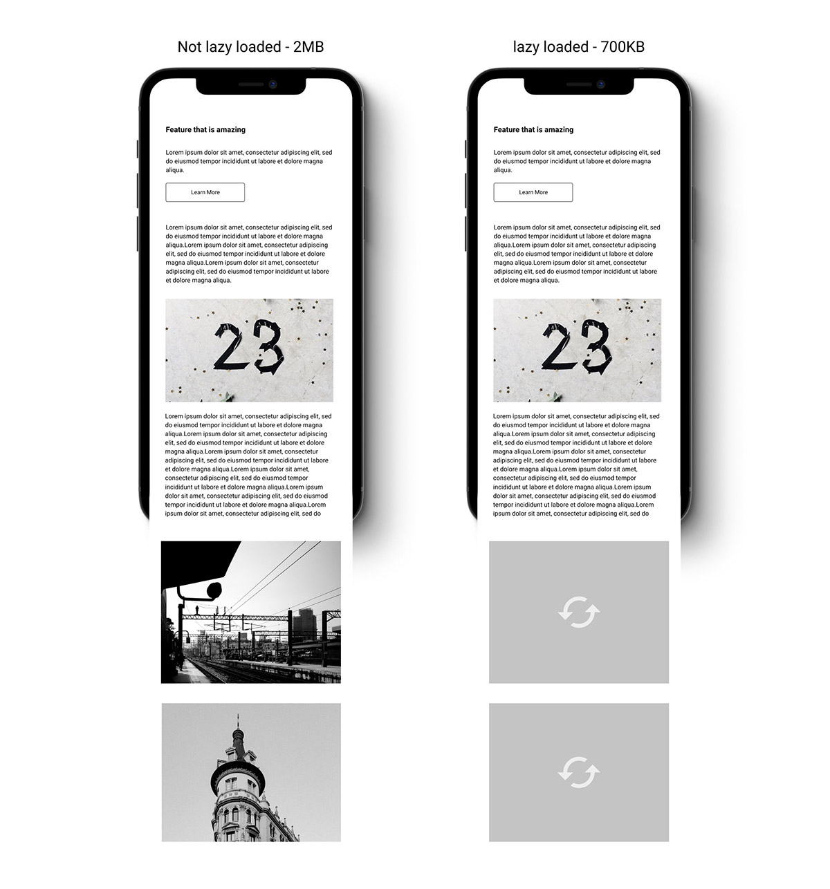
There are several methods to lazy load your images: using javascript and intersection observer, using a third-party library like lazysizes or the native loading attribute, which is not widely supported yet.
Use an image placeholder
Low-quality image placeholders are by no means a must-have – but a very nice touch that your users will definitely enjoy.
Using image placeholders will increase the preserved loading time of the website and will visually indicate to the user what to expect while the image is loading.
This is usually done by embedding a very low-quality Base64 image into the HTML, combined with a nice blur to make it look pretty.
A second, very nice approach is to just provide a background color representing the most dominant color of the image.

Conclusion
There are many things to consider and implement when it comes to images on the web:
- Compression and resizing
- Choosing the right formats
- Choosing the right sizes
- Lazy loading
- Image placeholders
And many things that go beyond the extent of this article.
Feeling overwhelmed? Well, don't!
We here at shetani have your back, just give us a call and we'll take care of the rest, so you can focus on your product and customers.
